
It is strange to even talk about custom reports based on vulnerability scans from Tenable products.
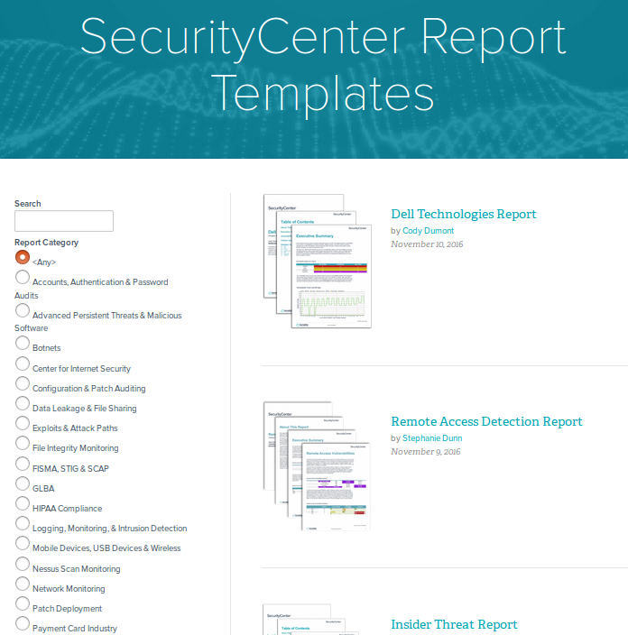
Just look at the variety of report templates available for SecurityCenter. For every taste and need! Why may you ever need to make any custom reports?
The thing is, if you want to use SecurityCenter reports you need to have all the scans of all your hosts in SecurityCenter and, as you know, SecurityCenter is licensed by IPs. What if you have tens of thousands of hosts? Price may be extremely high. In the other hand, you can take Nessus or SecurityCenter scan results via API (read how to do it in “Retrieving scan results through Nessus API” and “Tenable SecurityCenter and its API“) and process it with your own scripts for free.
The big advantage of Tenable products is that both Tenable SecurityCenter and Nessus use the same xml-based format of reports – Nessus2, so you need only one parser to process all report files.
Basically, vulnerability report is just a selection of vulnerabilities of some type and visualization of them with some graphs and diagrams. For example, vulnerabilities with high/critical vulnerabilities with public exploit available. In the other hand, do we really need diagrams for this? It can be described with the ticket in Jira.
Diagrams and graphs are really useful when we need to show the situation in dynamics. How the situation with critical vulnerabilities in our infrastructure was changing during some period of time.
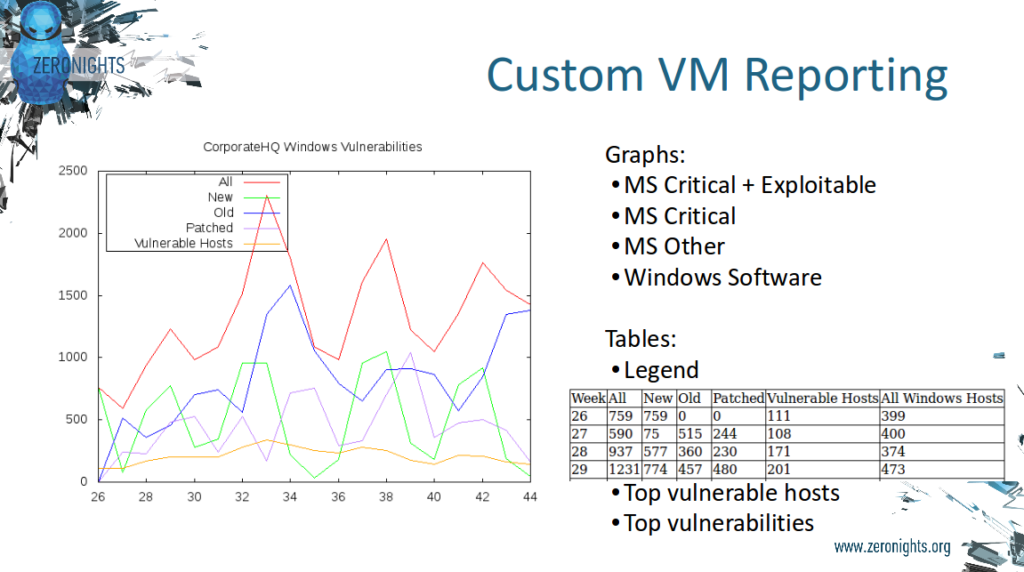
In this case, you can use “burn down chart” for vulnerabilities. The following graph I made using some generated data, but in real life it looks similar.
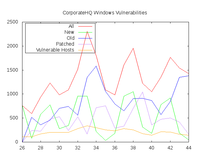
The vertical axis is amount of vulnerabilities. The horizontal axis is time (week or day number, depending on your scanning cycle).
- red line – all detected vulnerabilities at some moment of time
- green line – new (not seen earlier) vulnerabilities since last moment of time
- blue line – old (already seen) vulnerabilities since last moment of time
- purple line – patched (gone) vulnerabilities since last moment of time
- orange line – all detected hosts at some moment of time
Thus, if the red line is continuously going up, and the purple is near 0, nobody actually patches vulnerabilities.
You can build this graph, if you have data on vulnerabilities for every moment of time. This data can be in the same csv format, as I mentioned in “ VM Remediation using external task tracking systems” containing the fields:
- ip-address
- hostname
- category of vulnerability
- vulnerabilit id (detection plugin id)
- vulnerability title
- vulnerability description
Other reasons to use own dynamic charts:
- Advanced identification of the hosts – you can hard code any heuristic rules. For example, to detect that those multiple IPs or those different hostnames relate to the same host.
- Advanced remediation criteria. If we don’t see some vulnerabilities in the scan results, this does not mean that they all have been patched, right? May be some hosts were not scanned, because they were not available at scan time for some reason. And next time when we will see those vulnerabilities we shouldn’t consider them as a new ones. We should consider vulnerability as patched only if we scanned the host correctly and didn’t find it. In other case, we should use last week (day) results and wait for host to appear in future. Unfortunately, not all VM vendors think the same and make the graphs “smooth”. In real life availability of the host in scan results for average office network will be something like “+–+++-+-+” for weekly scans. So, additional processing is absolutely mandatory to get adequate view on vulnerability dynamics.
- You can build multiple diagrams for different groups of vulnerabilities. For example, one for critical and exploitable, another for other critical and third one for others. Most of efforts will be spent to keep diagram with most critical exploitable vulnerabilities.
You can also easily make the top of most vulnerable host and most widely used vulnerabilities.
This reposts are very useful in case of authentication scanning. Especially for office networks with Windows hosts. Vulnerabilities there are mostly from MS reports (patch Tuesdays) and vulnerability bulletins of 3d party software vendors. Thus, with this kind of reports we can check the patching process in your organization.
However, in case of unauthenticated scanning, you need to be especially careful and probably don’t use filtering by cvss and exploitability, because a lot of remote plugins in “CGI abuses”, “Web Servers”, “Misc.”, “General” may not have this parameters and you can easily skip most interesting, non-standard and critical issues. For unauthenticated scans different methods of assessments should be used, but let’s leave it for another post.

Hi! My name is Alexander and I am a Vulnerability Management specialist. You can read more about me here. Currently, the best way to follow me is my Telegram channel @avleonovcom. I update it more often than this site. If you haven’t used Telegram yet, give it a try. It’s great. You can discuss my posts or ask questions at @avleonovchat.
А всех русскоязычных я приглашаю в ещё один телеграмм канал @avleonovrus, первым делом теперь пишу туда.
Pingback: What’s actually new in Tenable.io VM application | Alexander V. Leonov