
Recently, the National Institute of Standards and Technology (NIST) introduced a new version of National Vulnerability Database (NVD) website.
I will not say that I liked this redesign:
IMHO, old website with US flag was much prettier and useful:
But the very fact that the site is developing, I really like very much. Let’s see what’s new there.
Very nice news that now you can download NVD feeds in JSON format.
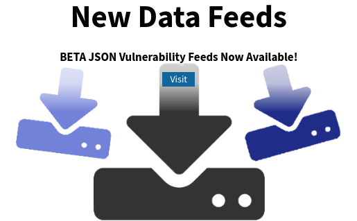
Here is the direct link https://nvd.nist.gov/vuln/data-feeds#JSON_FEED
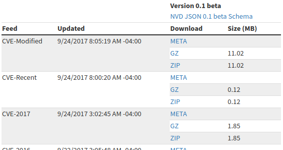
I have nothing against xml, but you must admit it’s much nicer when you can get data in a form of a python dict automatically. Analysis of this format is a topic for another post, but believe me, it’s quite simple and pretty obvious. =)
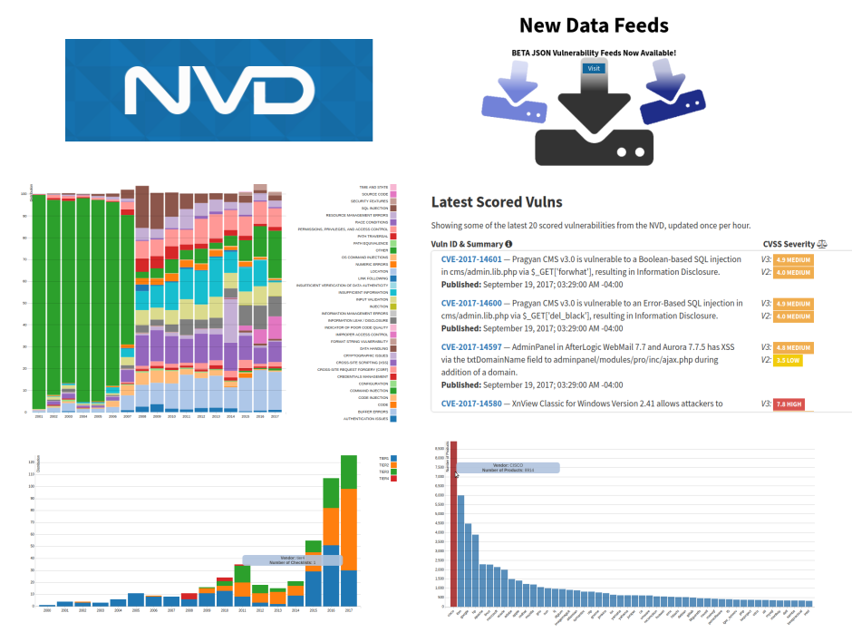
Secondly, they added some visualizations. Now you can see which CVEs were processed recently (adds CVSS vectors). They are displayed on the main page “Latest 20 scored vulnerabilities from the NVD”:
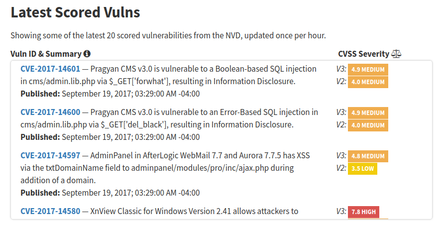
Note many CVEs from 2015 in this list, not only fresh vulnerabilities from 2017.
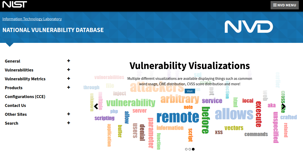
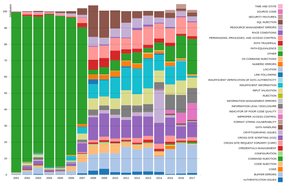
At https://nvd.nist.gov/general/visualizations/ you can see the diagrams for vulnerabilities. It’s certainly not a cvedetails.com yet, but way better than nothing. 😉
For example, Relative Vulnerability Type Totals By Year. It is a bit confusing that some years get out from 100%. 😉 Apparently because the same vulnerability can have several CWEs and the diagram is incorrectly drawn.
The same picture redrawn in a slightly different form (Vulnerability Type Change by Year):
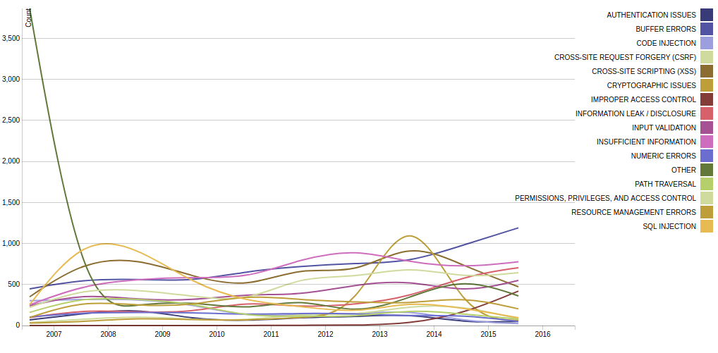
The positive thing is that over time the number of vulnerabilities with”other” CWE becomes much smaller. This means that the classification process is going well.
Here you can see vulnerabilities by product vendor (CPE):
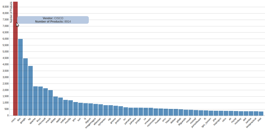
As usual, it’s very tempting to make a conclusion that Cisco products are most vulnerable. Of course it is not true. This only means that the vulnerabilities of Cisco products are described better than others.
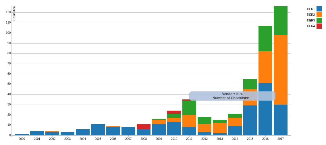
And here is a picture for the checklists (NCP), where situation is less clear.
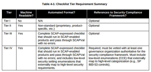
What was the idea. NIST has created a protocol for describing security content – SCAP. The main part of this protocol was OVAL – the standard that can be used to describe desirable state of a system using a set of criteria. You can see examples of OVAL content on Center for Internet Security OVAL repository. OVAL is a universal tool, however the most common usage of OVAL standard and SCAP is for describing secure configurations, for example, USGCB. Well, the actual National Checklist Program is a collection of such content in one of the four states:
- IV – Will work in SCAP validated tool
- III – Should work in SCAP validated tool
- II – Non-SCAP automation content
- I – Non-automated prose content
And, as we can see, the number of checklists that will exactly work in certified SCAP solutions not increases over time, but decreases. Imho, that can be because SCAP protocol is constantly changing and the certification process is changing, and there is no real motivation to make SCAP content, and especially to pass formal verification:
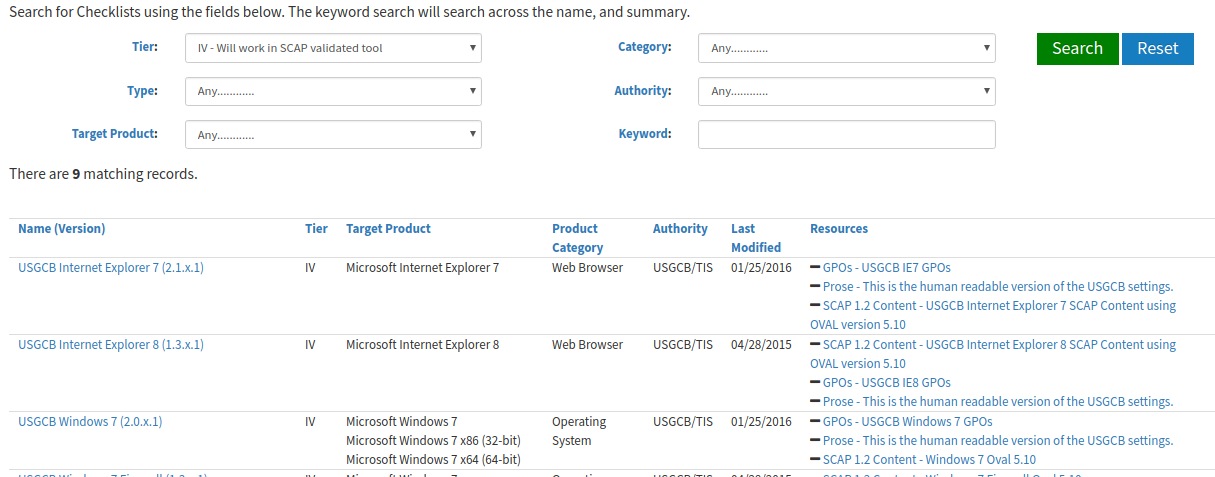
Note that the date on the diagram is the date of initial publication, not the last update. If we look for the checklists of the search engine, we can see tier IV content that was updated in 2015 and 2016:

Hi! My name is Alexander and I am a Vulnerability Management specialist. You can read more about me here. Currently, the best way to follow me is my Telegram channel @avleonovcom. I update it more often than this site. If you haven’t used Telegram yet, give it a try. It’s great. You can discuss my posts or ask questions at @avleonovchat.
А всех русскоязычных я приглашаю в ещё один телеграмм канал @avleonovrus, первым делом теперь пишу туда.
Pingback: Downloading and analyzing NVD CVE feed | Alexander V. Leonov